The planning question
As regional cities grow, urban development often expands into the productive land surrounding them. The market price of a parcel can make its development value obvious, but it says far less about the soil, water, climate, and location characteristics that make the same land valuable for agriculture.
The Innovative Land Index was created by Team CeRDIfy for GovHack 2019 to explore a different planning signal: could open data reveal where development would carry a larger, less visible cost to food production?
The pilot focused on roughly 12,200 square kilometres around Ballarat. The region offered a useful test case because it contains diverse soil types and agricultural uses while also facing significant population growth and urban sprawl.
Turning point queries into a landscape
The central technical challenge was the Agriculture Victoria Soils API. It could return soil attributes for one coordinate, but the project needed a continuous spatial layer that could be compared with rainfall, towns, and planning zones.
We generated a one-kilometre grid across the study area and queried the API for every point. Those results were brought into QGIS and interpolated into raster layers. The analysis considered characteristics including:
- organic carbon;
- electrical conductivity and salinity;
- available water capacity;
- variance from an agriculturally useful soil pH;
- average annual rainfall; and
- distance to the nearest major urban centre as a proxy for food miles.
Each dataset used different units, so the layers were normalised before being combined. Variables generally associated with agricultural productivity—carbon, water capacity, and rainfall—contributed positively. Salinity and greater distance from distribution centres reduced the relative score.
The result was not a single claim about what a parcel was worth. It was a comparable index showing where several agricultural advantages overlapped.
Making the model inspectable
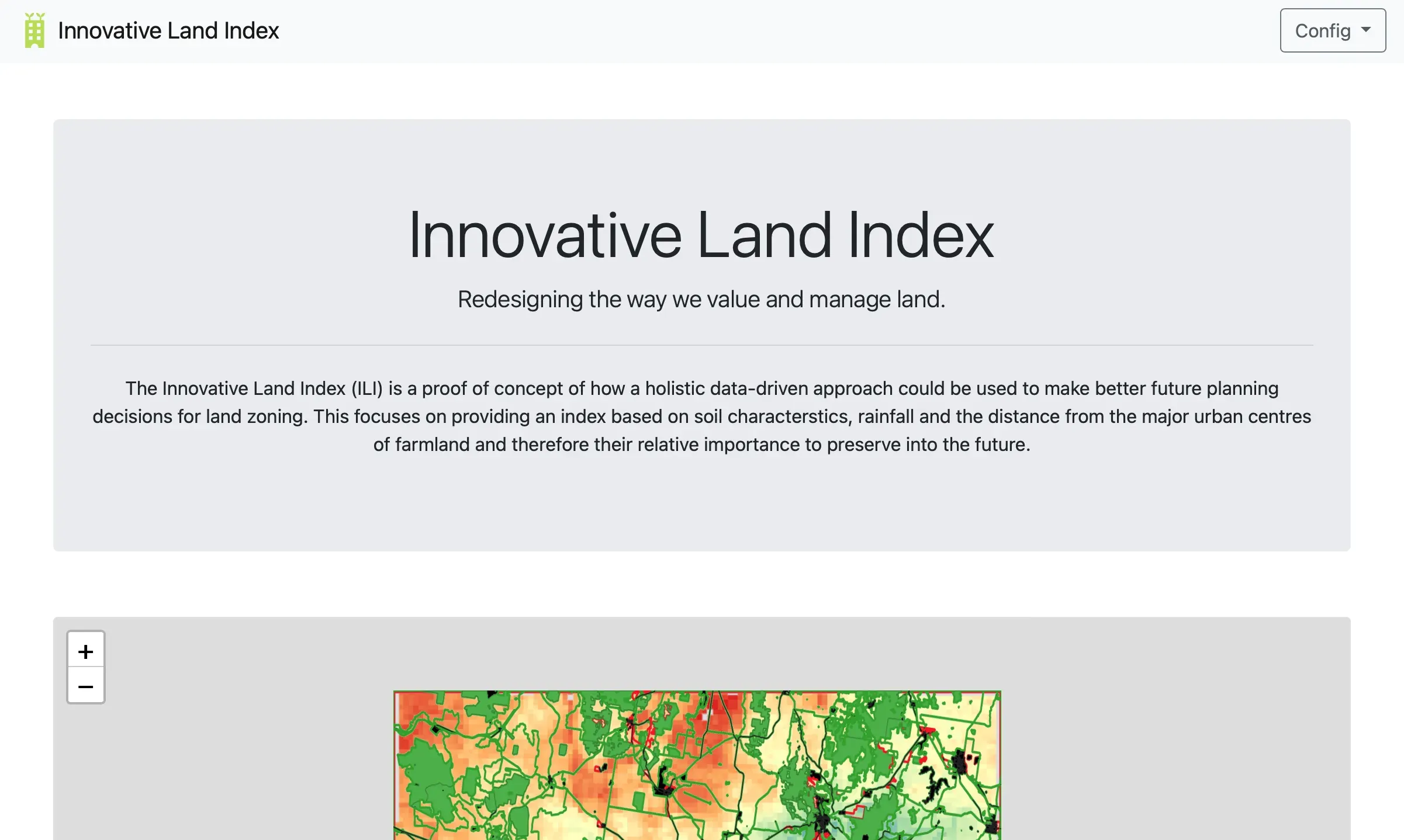
The output became an interactive Leaflet map rather than a static report. Users could view the index as a colour layer and compare it with simplified planning boundaries for agricultural, rural-living, conservation, urban, and infrastructure zones.
That comparison made the idea tangible for several audiences:
- Planners could see where proposed growth might consume comparatively valuable agricultural land.
- Farmers and agricultural decision-makers could explore the relationship between location and productive characteristics.
- Communities could discuss food security and urban growth with something more concrete than a boundary line.
- Environmental specialists could identify where a broader model should incorporate water, habitat, and ecological constraints.
The important caveat
ILI was explicitly a proof of concept, not a planning instrument. The source API was not available as a native raster service, so interpolating point queries reduced the resolution and certainty of the original data. The first model also gave variables equal weight where a real planning tool would require domain experts, transparent governance, peer review, and sensitivity testing.
Making that limitation visible was part of the project. Data-driven planning is only trustworthy when people can inspect both the model and the assumptions behind it.
What I learned
The Innovative Land Index was an early lesson in turning technically available data into something decision-makers can reason about. The difficult work was not drawing a map; it was choosing what the colours meant, showing how they were produced, and resisting the temptation to present a prototype with more authority than it had earned.
That combination—public data, visible methodology, interactive explanation, and honest uncertainty—continues to shape how I think about technology used in public decisions.